Repositioning a clinic with such a rich history is a major challenge. brandtouch° supported us throughout the process with foresight, empathy and a clear vision. We are more than satisfied – and truly proud of the result.

Laura Terzagui Fernández
Brand, Marketing, Communications and Commercial Director, Mecurius Health Group

WEGE Clinic

The WEGE Clinic in Bonn (formerly Robert Janker Clinic) is a specialist clinic operated by Mercurius Health for radiotherapy and radio-oncology, palliative medicine, neuroradiology and radiology. Cancer is diagnosed and treated here on both an outpatient and inpatient basis. The oncology centre at the specialist clinic is the only non-university facility in Germany to have high-precision radiation equipment.
Challenge

At the beginning of 2023, the Mercurius Health Group took over the Robert Janker Clinic, which previously belonged to MEDICLIN Aktiengesellschaft. At the same time, Mercurius Health and the clinic in Bonn began working together. Following the acquisition of the clinic, a complete modernisation and brand relaunch took place.
brandtouch° was involved in the entire process: from qualitative market research and the development of identity and positioning to naming, brand design and brand communication – always in close consultation with the decision-makers at Mercurius Health and the clinic’s team of chief physicians, who continue to play a key role in shaping the direction of the clinic.
The challenge was to fundamentally transform the image of the institution formerly known as Robert Janker Clinic. Although the clinic employs world-renowned medical professionals and attracts patients from all over the world for its advanced treatment methods, it suffered from a somewhat negative regional reputation from the past.
The goal was to reposition the clinic: to modernise its public perception, shed its outdated image and present the clinic as the innovative and pioneering institution it actually is – for regional and international patients alike.
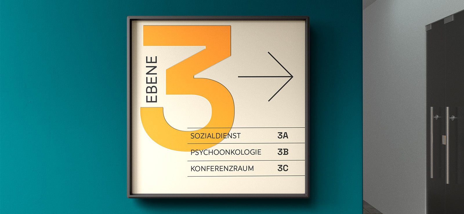
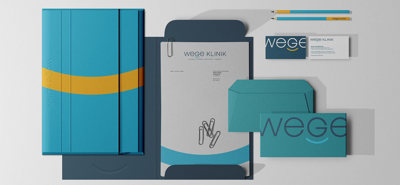
A new name and a redesigned corporate identity were intended to visually support the repositioning and communicate the clinic’s new self-image as a brand to the public.

Strategic Approach

The basis was formed by well-founded research: in-depth interviews with all stakeholders, on-site analyses and international benchmark research on leading oncology clinics and cross-industry best practices.
The brand exploration workshop identified the core values of the clinic: an exceptional level of empathy combined with highly innovative treatment approaches – all driven by a commitment to consistently developing medical procedures with the patient in mind. These core positioning factors shaped all further measures.
Implementation

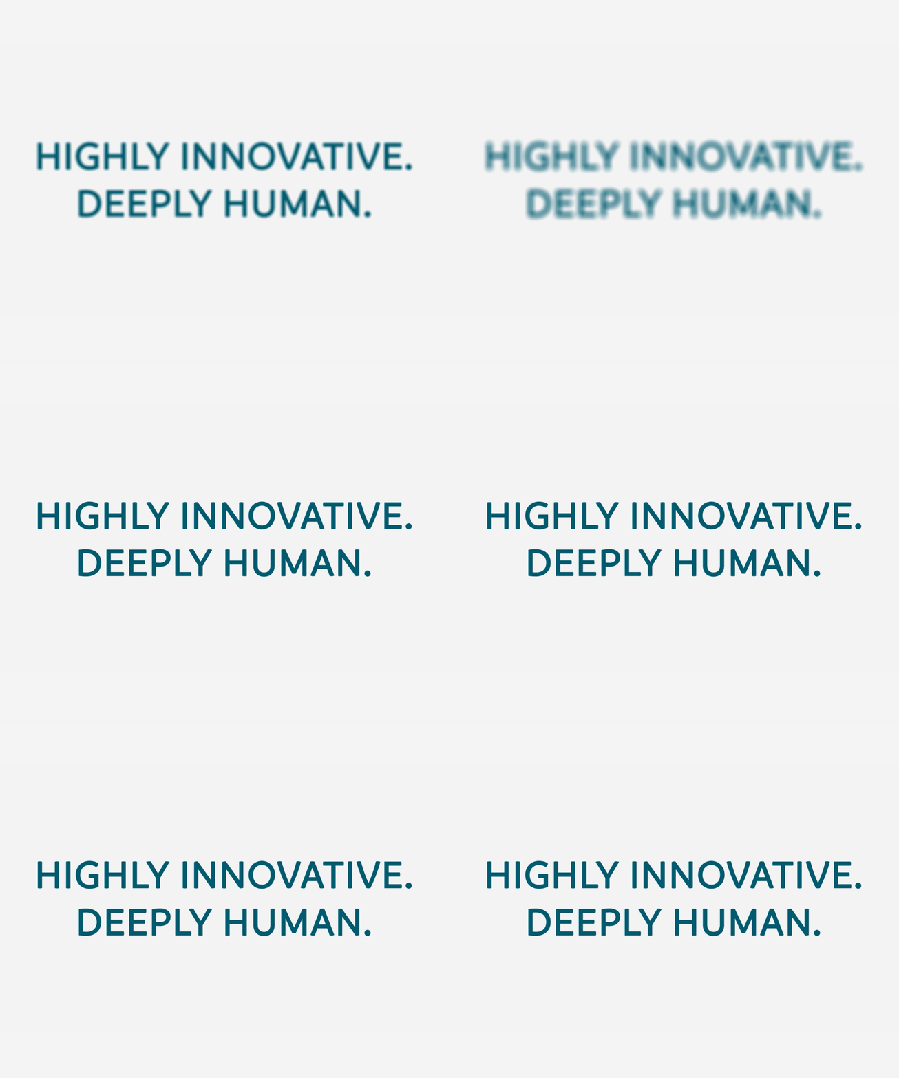
The new positioning is based on the clinic’s commitment to innovation, interdisciplinary collaboration and empathetic patient care. Condensed into the brand essence – highly innovative, deeply human – these qualities make the clinic a pioneer in tumour treatment.
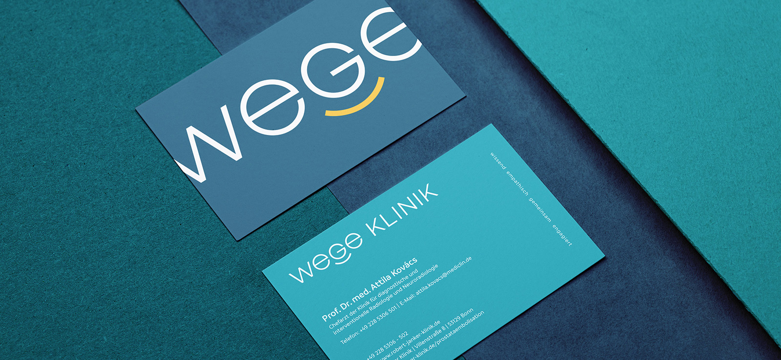
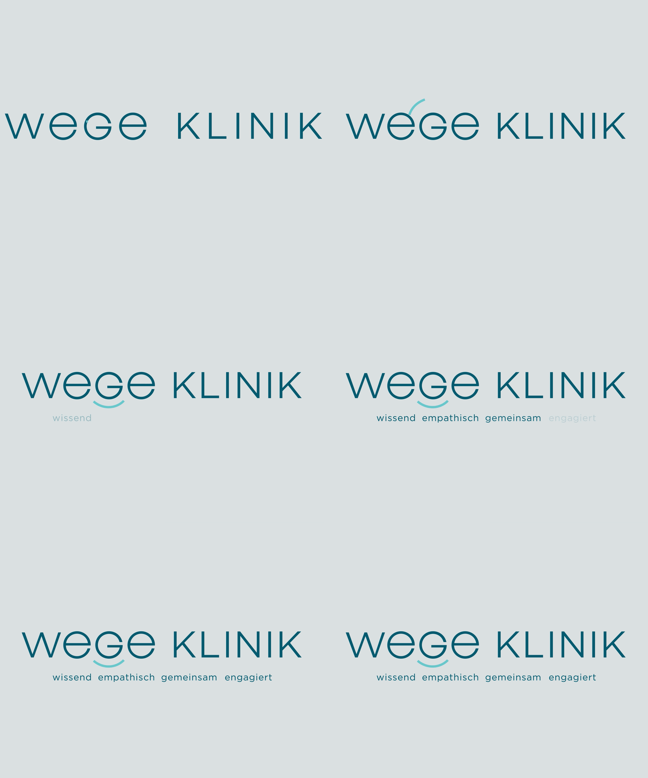
The acronym ‘Wissend, Empathisch, Gemeinsam, Engagiert’ (Knowledgeable, Empathetic, Collaborative, Committed) gave rise to the new name: WEGE Clinic.
The corporate design reflects this self-image: the logo typography combines expertise with warmth through its fine lines. A graphic element is reminiscent of a subtle smile. The chosen typography deliberately breaks with the traditional image of a clinic and underlines the clinic’s modern approach. Like the acronym, the brand colours are divided into four parts – each colour represents a central brand characteristic: competence, empathy, connection and commitment.
The brand font combines seemingly contradictory elements: technology and soft, rounded shapes. Subtle curves without superfluous details create friendliness and warmth – visually and conceptually in harmony with the logo and brand.
The result: a brand identity that gives the clinic’s medical excellence a contemporary face and inspires confidence at first glance.

Mehr Cases

hkk

Johann Jacobs Haus

Romp

Femtasy

Rubiac

Milram