»It was a tough workout, but brandtouch° helped us strengthen our identity in an extremely competitive market environment.«
»It was a tough workout, but brandtouch° helped us strengthen our identity in an extremely competitive market environment.«
Mareike Küfer
Marketing Director BODY ATTACK
BODY ATTACK is one of the leading brands in the sports nutrition market. For almost 30 years, the Hamburg-based company has provided the most demanding athletes with a wide range of high-quality products. The BODY ATTACK assortment is found in various fitness studios, sports clubs, wholesalers, and stores within the DACH region (Germany, Austria, and Switzerland).
The sports nutrition market is highly competitive and saturated. In recent years, the segment has seen an increasing level of new start-ups entering the market. Traditional food brands have also jumped on board the trend toward more healthy and functional nutrition. As a result, brands and products are becoming increasingly similar.
BODY ATTACK needed to differentiate itself from the competition through a clear and distinct positioning. This required a more modern appearance with an unmistakable and confident self-image. In achieving this, BODY ATTACK remains relevant for the target groups while continuing to assert itself within its brand environment.
We positioned BODY ATTACK firmly within the progressive performance lifestyle segment. The campaign standpoint is markedly different from the holistic approach of the competition. This unique niche also means even big food companies and start-ups cannot compete on this communicative level. For us, a clear indicator that this is where BODY ATTACK’s origins and core competencies are meant to be.
Thanks to its extensive experience, BODY ATTACK offers exceptional products for a certain, highly performance-oriented target group. This includes nutrition for people who are deeply dedicated to their sport/fitness lifestyle and their diet. BODY ATTACK shares a passion for performance which is a foundation of the brand. It’s an attitude that is reflected and lived out through the new positioning: Attack Your Limits!
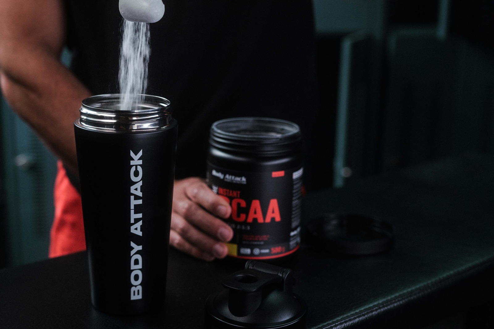
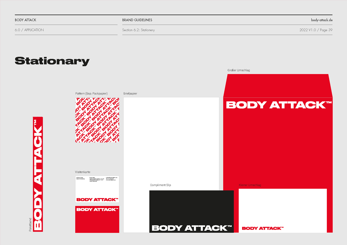
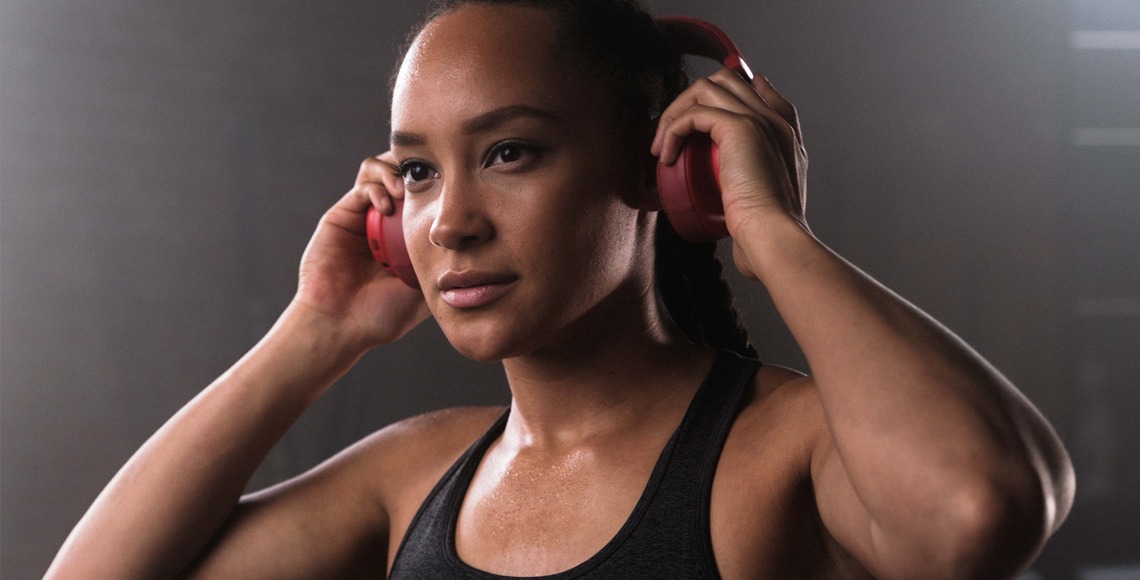
The performance aspect of the brand is visually brought to the forefront by the brand name written in bold capital letters. The typography is in part inspired by the design patterns from high-performance sports such as Formula 1.
The authentic, dark photographic style celebrates passion, determination, and all the hard work that goes into achieving your personal fitness goals. The lively and engaging messaging, combined with the fresh brand language speaks directly to athletes and encourages them to be the best they can be.