»brandtouch° quickly understood the challenges our brand was facing. With their expertise and élan, the team quickly developed outstanding solutions ideally suited for this dynamic sector. We look forward to working with brandtouch° in the future.«
»brandtouch° quickly understood the challenges our brand was facing. With their expertise and élan, the team quickly developed outstanding solutions ideally suited for this dynamic sector. We look forward to working with brandtouch° in the future.«
Lars Kilchert
CEO pflege.de
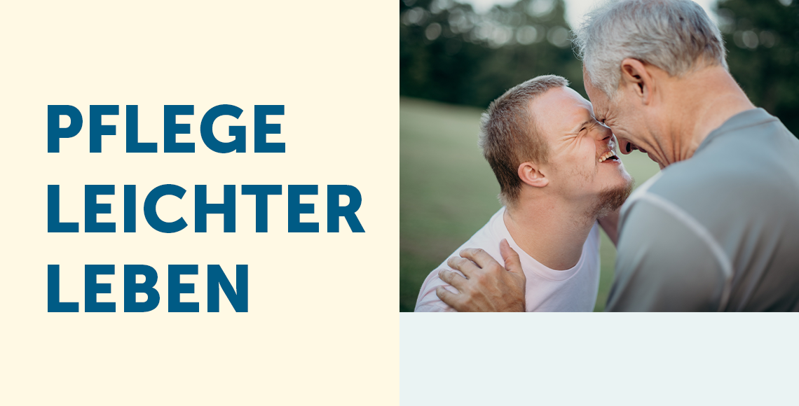
Since its beginning in 2011, the Hamburg-based online portal pflege.de has established itself in Germany as a leading service provider covering all aspects of living with special care/needs people. Thanks to its in-depth articles, magazine, placement services, and live consultation, pflege.de assists people in need of care and caregivers during their often-challenging daily routines. Always eye-to-eye and with the utmost competence.
In the past pflege.de has primarily focused on a rational, hygienic appearance and rather cool, factual communication. The target groups perceived the brand accordingly: very competent, but emotionless – a “means to an end”.
brandtouch° was tasked to develop a uniform brand concept for pflege.de that would strengthen the company’s recognition value. Because the brand operates at a sensitive time in life for all parties involved, the concept needed to strike a good balance between modernity, reality of life and the different target group’s digital proficiency.

From the very beginning, we are all dependent on care. Without the help and love of parents, getting off to a good start in life can be difficult. It’s the same when we grow old and are again dependent on caregivers. That’s why we placed pflege.de at exactly this crucial juncture while positioning it as a solutions provider that offers everyone comprehensive support for all aspects of everyday care. After all, for pflege.de, the requirements and challenges of those in need are just as important as those of caregivers. For pflege.de that means being there for everyone with new solutions that ease uncertainties, and build confidence – all while reflecting the other crucial aspects of care: love, closeness, and unforgettable moments.
The implementation reflects this visually as well as linguistically. Warm pastel tones and watercolors complement the authentic, sympathetic imagery, and the language communicates information as simply as it does empathetically, with warmth and competence. Different from the care imagery, the result is a harmonious brand image that expresses the unique understanding of care. Encouraging, informing and supporting for all those who live it every day.